Case Study
SkiLand
Redesigning the Path to the Perfect Ski Trip
UI/UX
Minimalist UI
Conceptual Project
/Chapter 1
A Confusing and Overcomplicated Website
When the SkiLand team reached out to me, their website was in dire need of a revamp. Specializing in ski trips to Italy, SkiLand’s existing site had evolved in fragmented stages over time, resulting in a disjointed, confusing user experience.
With clashing colors, an overwhelming design, and a search system that left users frustrated, the website wasn’t effectively supporting their business. Their top priority was to create a clean, intuitive experience, particularly focusing on the homepage and the all-important trip search page.
/Chapter 2
A Fresh Start with Minimalism
During our initial meetings, SkiLand’s request was clear: simplicity, functionality, and a design that evoked the beauty of the mountains and the ski experience itself.
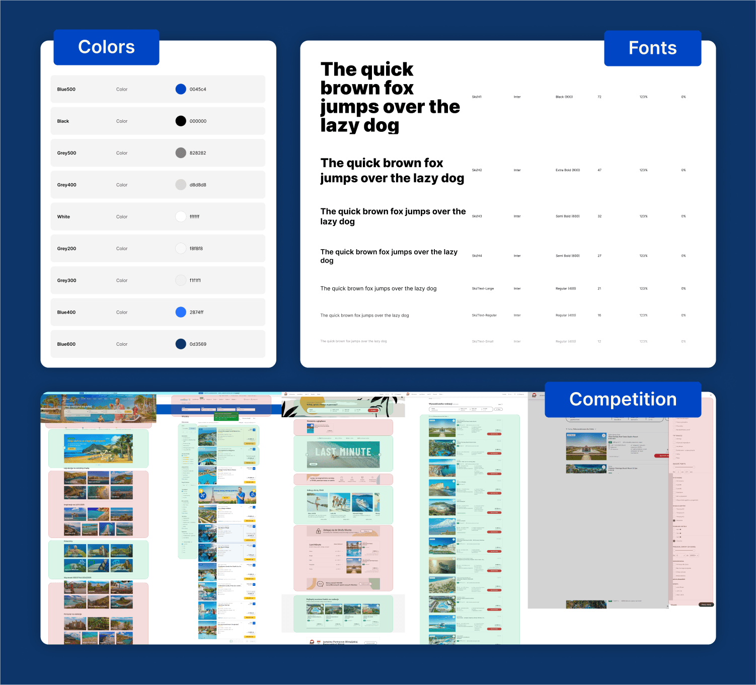
They wanted a minimalist approach that felt aligned with their brand, capturing the sleek, crisp feeling of snow and the thrill of skiing. It was important to eliminate distractions, reduce the number of colors, and streamline the overall interface, making it easier for users to quickly navigate and book their ideal ski vacation.
/Chapter 3
From Chaos to Clarity
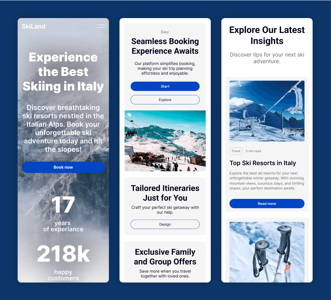
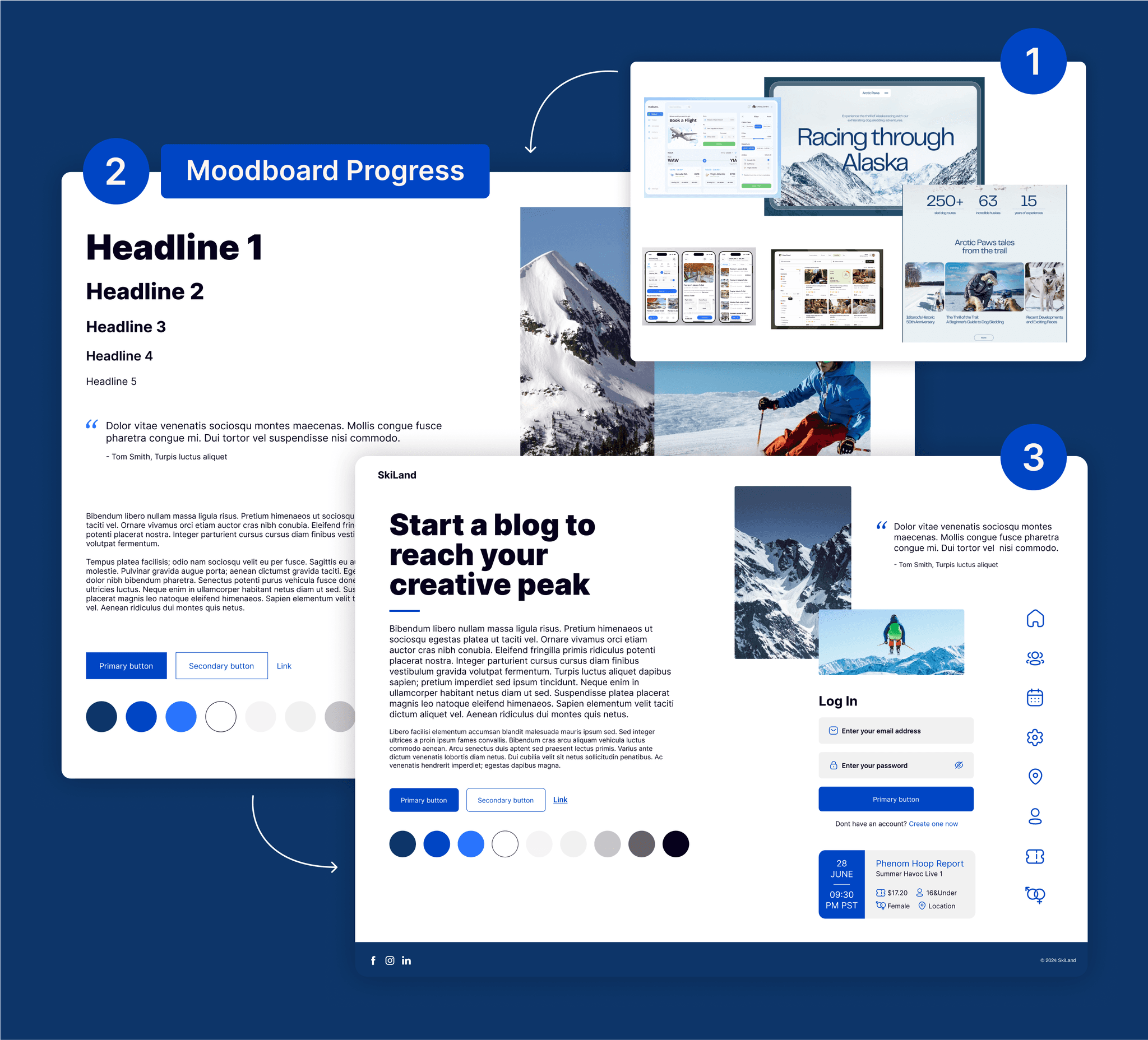
I began by stripping away the unnecessary elements and complexity that had crept into the original site. First, I tackled the color palette, reducing it to clean, neutral tones that reflected the serenity of snowy mountains. Cool blues and whites replaced the overload of colors, creating a calming backdrop for the site’s content. The visuals were kept simple and purposeful, drawing users' attention to what mattered most—choosing their perfect ski trip.
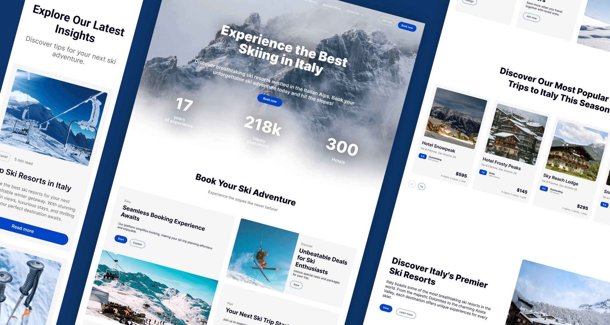
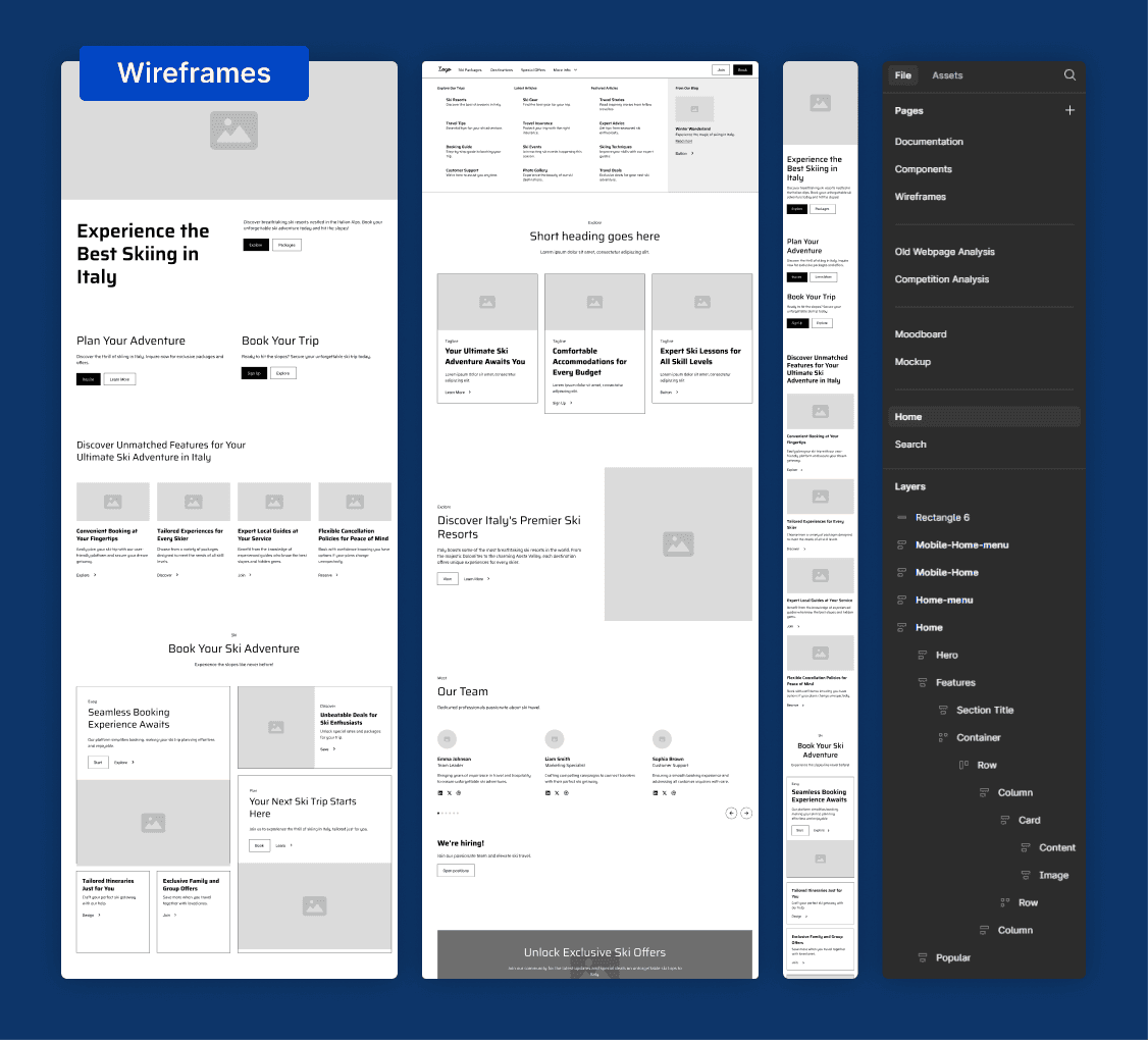
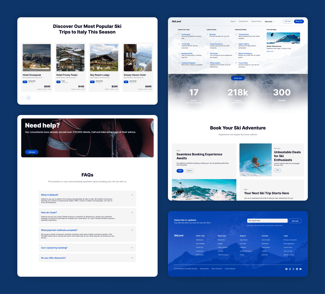
For the homepage, I focused on building a clear, intuitive layout. Large, bold visuals of the Italian Alps were combined with easy-to-use buttons and navigation options. The user journey was streamlined to guide visitors smoothly from browsing to booking.
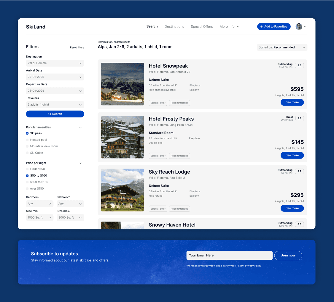
The search page was a key focus. I completely restructured it to simplify the process of finding ski trips. The new design featured an easy-to-use search bar with clear filters for trip length, difficulty, and location. Users could now effortlessly navigate and find the right package, whether they were beginners or seasoned skiers.
/Chapter 4
SkiLand’s Fresh New Face
The results were immediate. The new SkiLand website not only looked visually striking but provided a vastly improved user experience. By embracing minimalism and reducing clutter, the design invited users to focus on what SkiLand offered: the best ski trips to Italy. The client was particularly pleased with the ease of use on the search page, noting a reduction in user confusion and an increase in completed bookings.
In the end, the SkiLand website became more than just a booking platform; it became a sleek, easy-to-navigate experience that reflected the crisp, exhilarating essence of skiing in the Alps. The project perfectly demonstrated the power of design to transform not just aesthetics but functionality.